

While pasta water simmers and yesterday’s coffee mug still sits on the counter, it is easy to lose time scrolling through Scandinavian kitchens on Instagram and studying the cabinet colors. After falling into a serious rabbit hole, one thing becomes clear: the palettes are simple, calm, and repeated, yet every kitchen still feels different and wildly pretty.
Here is a closer look at the color combinations appearing again and again in Scandinavian kitchen design, using ten incredibly good real kitchens as a colorful tour.
You may not be ready to gut your kitchen tomorrow, but you can still borrow these palettes through paint, tile, wood, or even a few accessories.
Warm Neutrals and Cool White Kitchen Palettes
Scandinavian kitchen palettes can change the mood of a room in different ways. Warm neutrals bring one kind of feeling, while cool whites create another.
Warm Neutral Kitchens
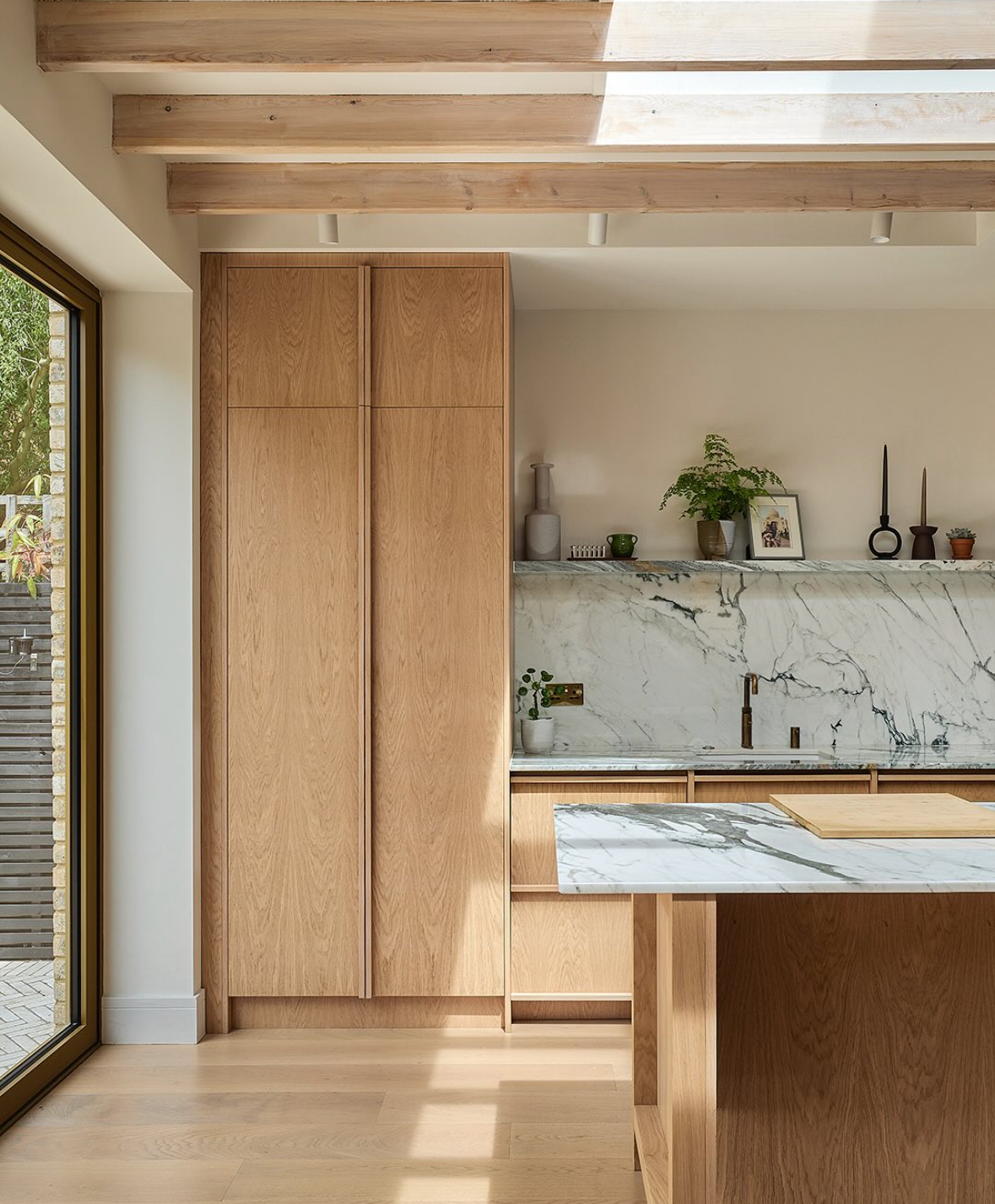
Honeyed flooring runs through Leigh’s Chiswick kitchen, designed by Nordiska Kök, and exposed beams sit overhead. A large marble backsplash with charcoal veining adds weight, while soft-white, white-pigmented oak cabinetry keeps the Scandinavian kitchen warm. A skylight illuminates the room.
The curved oak island comes before tall, creamy cabinetry with fluted-glass doors in the Halmstad shaker kitchen. Beige, sand, and oat shades keep the timeless shaker scheme gentle, while simple knobs and rounded cabinet corners prevent a flat appearance.

The classic Keephousing all-cream kitchen brings together 3 detailed elements, including brass hardware, a shiny subway tile backsplash, and detailed cabinet doors. Warm white avoids a sterile appearance and creates a soft atmosphere, while the wood herringbone floor adds another material detail.

The CS Joinery oak kitchen uses natural-oak cabinetry with white counters and a pale backsplash. Stainless steel moderates the warm palette, giving the kitchen a calm, timeless style.
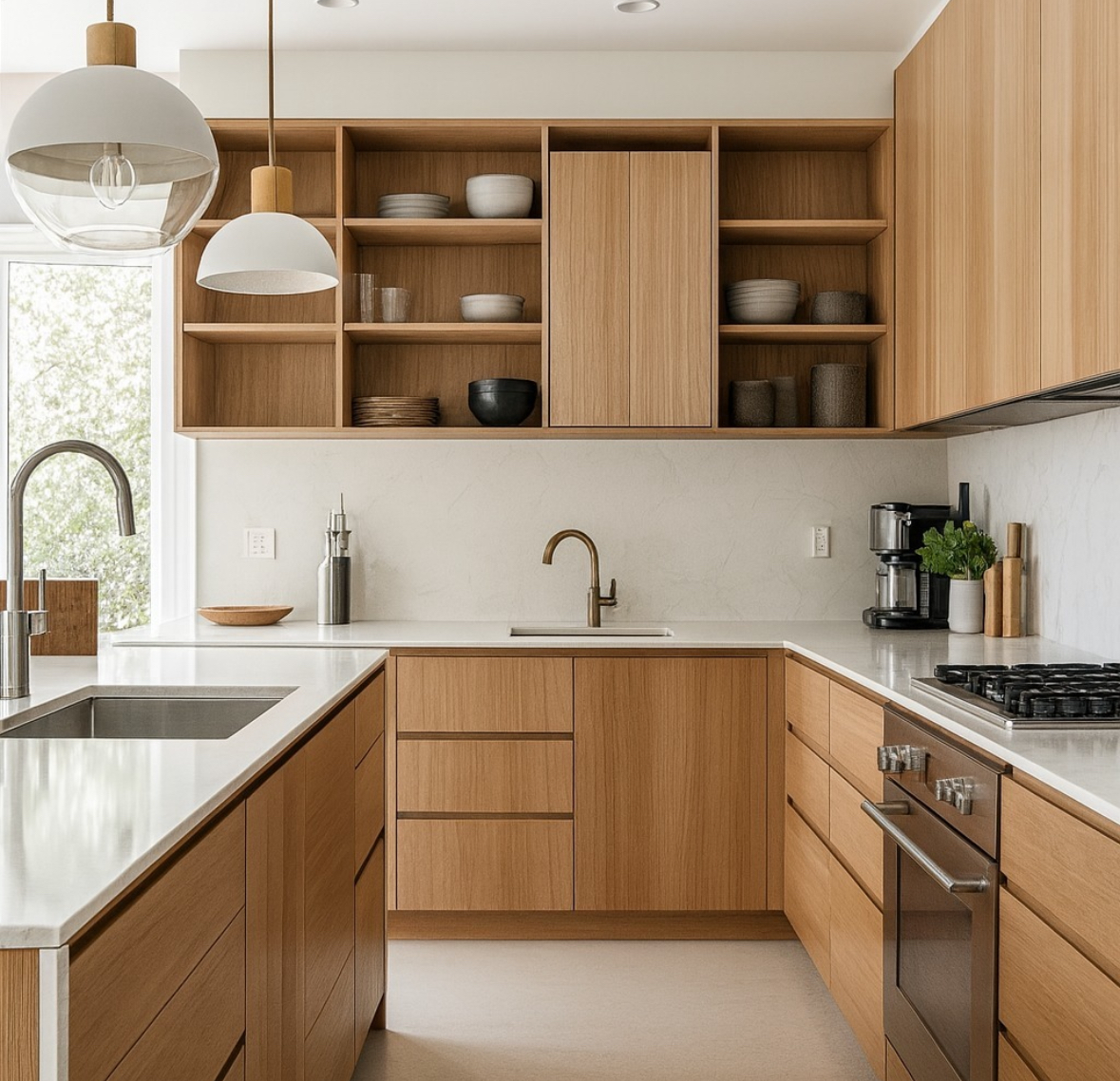
A warm-neutral palette typically combines wood with golden or sand undertones, paint and stone in a warm off-white temperature, and brass, beige, or taupe metals rather than icy chrome.
Consider a warm-neutral palette when you have warm floors or live in a cloudy climate. It also forgives visible crumbs.
Cool White Kitchens
Cool whites are less like a candlelit cabin and more suited to a minimal, architectural Scandinavian kitchen style. The result is a cooler, cleaner direction.

Thin marble veining adds detail to the white backsplash, while the icy white waterfall counter keeps the palette bright. In this Rochester kitchen from Cornerrenovation, white remains the dominant color, with white walls and a ribbed oak island set beneath a huge window that provides cool daylight.
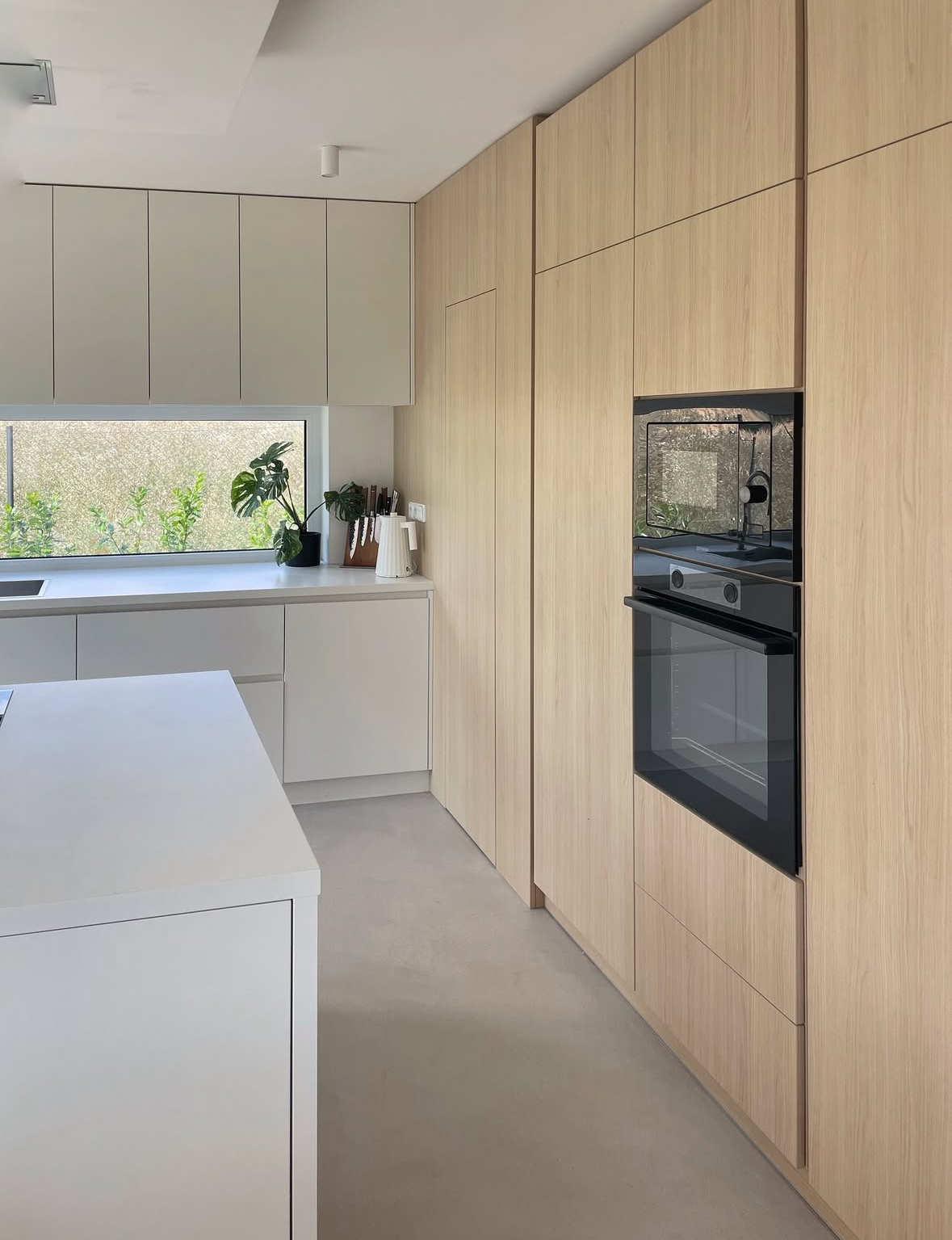
Light-neutral counters and floors run through the Hometure_cz kitchen. Tall upper cabinetry in pale wood sits above low white handleless cabinetry, and the white handleless island follows the same clean approach. Concealed appliances support the kitchen’s minimal visible clutter.

A large branch in a vase sits beside a pot of hydrangeas, adding a natural detail to Sarah Strath’s kitchen. Soft greige cabinets and white tile keep the space fresh.
Choose cooler whites for bright modern kitchens to create a friendly atmosphere. These kitchens need plenty of natural light or really good artificial lighting, while wood floors, oak chopping boards, and a woven tray add warmth. Keep surfaces fairly clear so the crisp lines remain visible.
Josie’s Victorian flat renovation featured a white kitchen. Bright white kitchens can make darker colors feel more appealing by contrast.
Muted Kitchen Colors
Sage, smoky blue, and mushroom greige function as near-neutrals. Muted colors offer an alternative to full white or an all-wood kitchen.
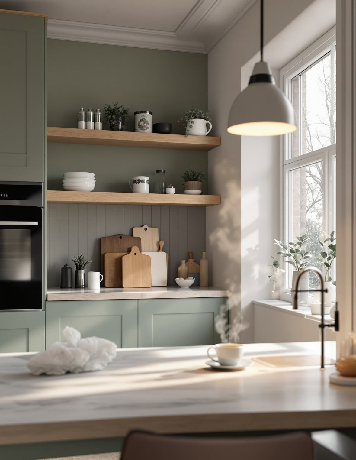
In the renovated Vlasconstruction Utrecht townhouse kitchen, pale birch shelves sit against a deeper green wall above matte sage lower cabinets. A steaming coffee adds a lived-in detail, while the sage-and-green palette provides personality and creates a soft mood.
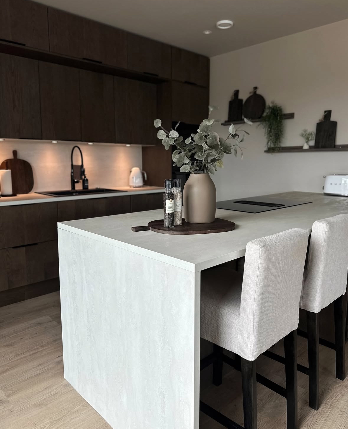
The Home by Stine kitchen uses chocolate-colored dark-wood cabinets with pale counters and an island wrapped in light stone. The limited, calm palette gives the dark wood a cocoon feeling.
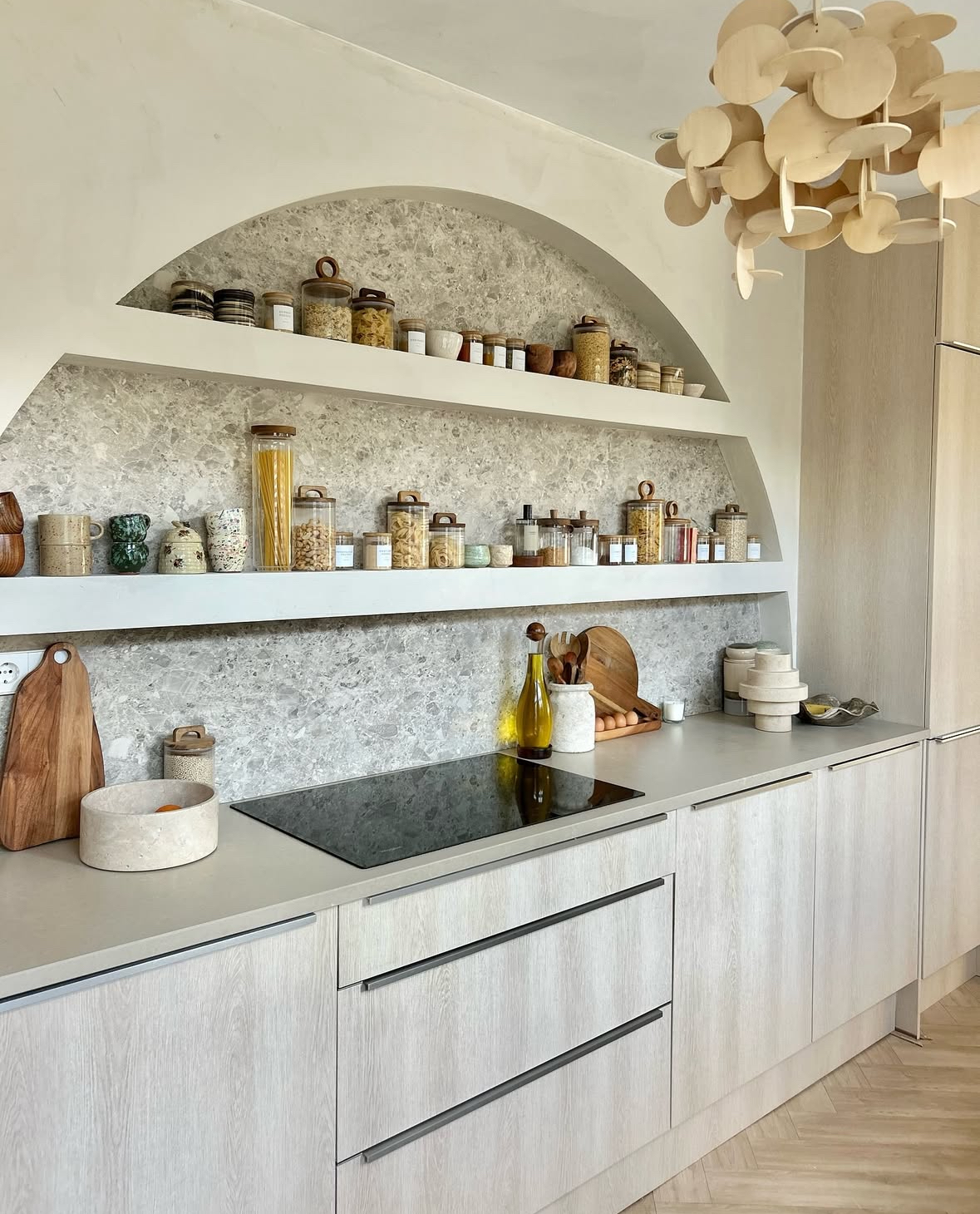
Green ceramics, a sculptural wood pendant, and a long pair of shelves holding jars and cups add shape to the Hetkijkhuis kitchen. Light-greyed oak cabinets and a speckled-stone backsplash sit within an oatmeal, stone, caramel, and green palette, while a large arched niche adds another strong form. Texture and shape provide visual interest within the neutral palette.
Use soft kitchen colors in these ways:
- Keep the upper cabinets and walls light while giving the lower cabinets one of three colors: sage, blue-grey, or warm greige.
- Pair muted colors with natural wood, rattan, and linen to support an organic appearance without moving away from the soft palette.
- Repeat an accent color in a tea towel, mug, and plant pot to make the room look intentional.
Muted palettes retain a calm, minimal appearance and can hide cabinet-door mess better than pure white.