

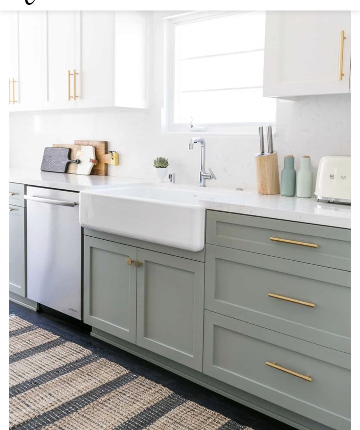
Two-tone cabinets can refresh a kitchen by pairing different colors or finishes across the cabinetry.
This approach can update the room without requiring a complete remodel.
This design trend combines different colors or finishes across your upper and lower cabinets to add depth and visual interest.
When the colors of your upper and lower cabinets complement each other, the kitchen can shift from plain to polished. The right pairing can also make the room feel larger and more dynamic.
Many homeowners are trying this look with white shaker cabinets above and darker base cabinets below. Another popular direction brings in warm wood tones for an inviting contrast.
There is no need to choose dramatic colors to make an impression. Subtle differences can work beautifully too, such as matte black with warm wood, or high gloss white alongside a gentler neutral shade.
Whether your small kitchen needs an airier feel or your larger room lacks dimension, two tone cabinets can offer both flexibility and style.
This straightforward update can give your kitchen a completely refreshed appearance. Even better, it can do so without breaking the bank.
Two-Color Kitchen Cabinet Scheme
Decorative Details
In a two-tone kitchen, choose accessories that pick up both cabinet colors or echo the hardware finish. Plants in ceramic pots that match the secondary cabinet tone create visual flow through the space, while glass vases in the accent cabinet color add another small color detail. Choose simple prints in both cabinet finishes and frame them as wall art. Black-and-white photography adds another decorative detail to a modern kitchen when placed against the colorful cabinets.
Wood cutting boards echo the cabinetry when one cabinet finish is wood, giving the material a visible place in the kitchen. Metal fruit bowls can use the same finish as the hardware, keeping the bowl connected to the rest of the kitchen.
Color Harmonization
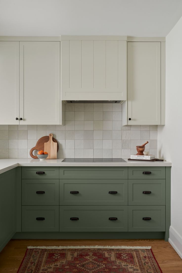
A color wheel can be a useful starting point for choosing cabinet colors. Use it to see how different colors relate before making a selection.
Blue and green sit near each other on the color wheel. Adjacent colors such as these can create a harmonious, relaxing feel.
Cream upper cabinets paired with light sage lower cabinets feel fresh without creating a jarring effect. You can also use shades from the same color family, such as navy upper cabinets with light blue lower cabinets.
Countertops, backsplashes, and flooring should coordinate with the cabinet colors. When these kitchen elements work together, they create a cohesive look.
Timeless Cabinet Combinations
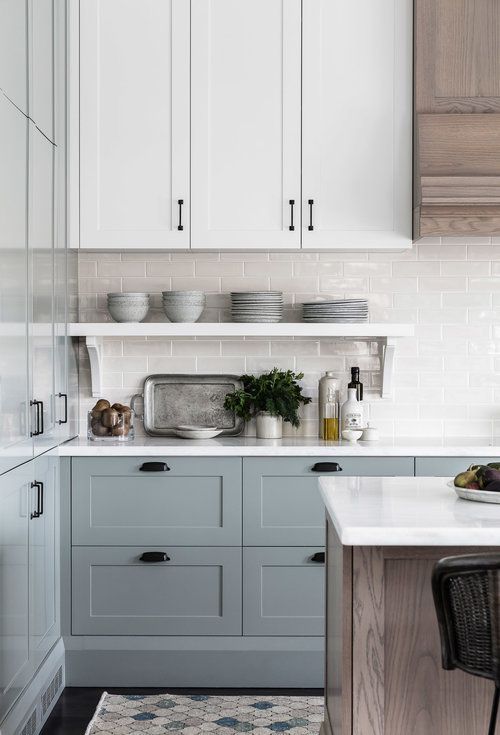
For a lasting look, focus on classic cabinet color combinations that remain easy to live with over time. White upper cabinets paired with medium-gray or soft-blue lower cabinets are less likely to date quickly: the lighter upper color keeps the combination familiar, while the lower cabinets add color.
Medium-stained walnut or maple lower cabinets pair well with white or cream upper cabinets, creating a combination with both freshness and warmth. Use the 60/30/10 rule when dividing the palette: 60% for the dominant color, 30% for the secondary color, and 10% for the accent color. This balance can prevent an overly trendy appearance.
Hardware also influences how timeless cabinets look, so consider its finish alongside the cabinet materials. Brushed nickel and brass finishes suit classic pulls and keep the hardware familiar, while overly decorative pulls may become dated over time.
Bold Cabinet Trends
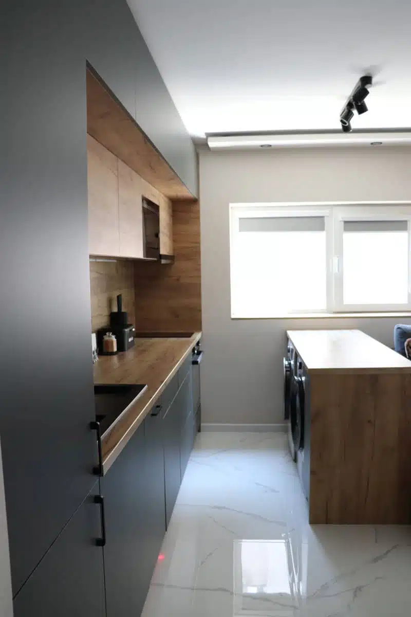
Current approaches range from subtle color differences to strong contrasts between upper and lower cabinets. Matte black lower cabinets create a strong contrast with natural wood above them, combining a dark finish with a warm material for a clear two-tone pairing. Pairing matte-black lower cabinets with suitable upper cabinets and surrounding surfaces can add depth without making the room feel too dark.
In 2025, lower cabinets in bold navy or forest green are gaining popularity, especially when balanced with white upper cabinets. These deeper colors can add character without overwhelming the space.
A patterned or bold backsplash paired with white cabinets offers another, simpler approach to a two-tone scheme, allowing the pattern to become the main visual feature.
Wood-Paint Combinations
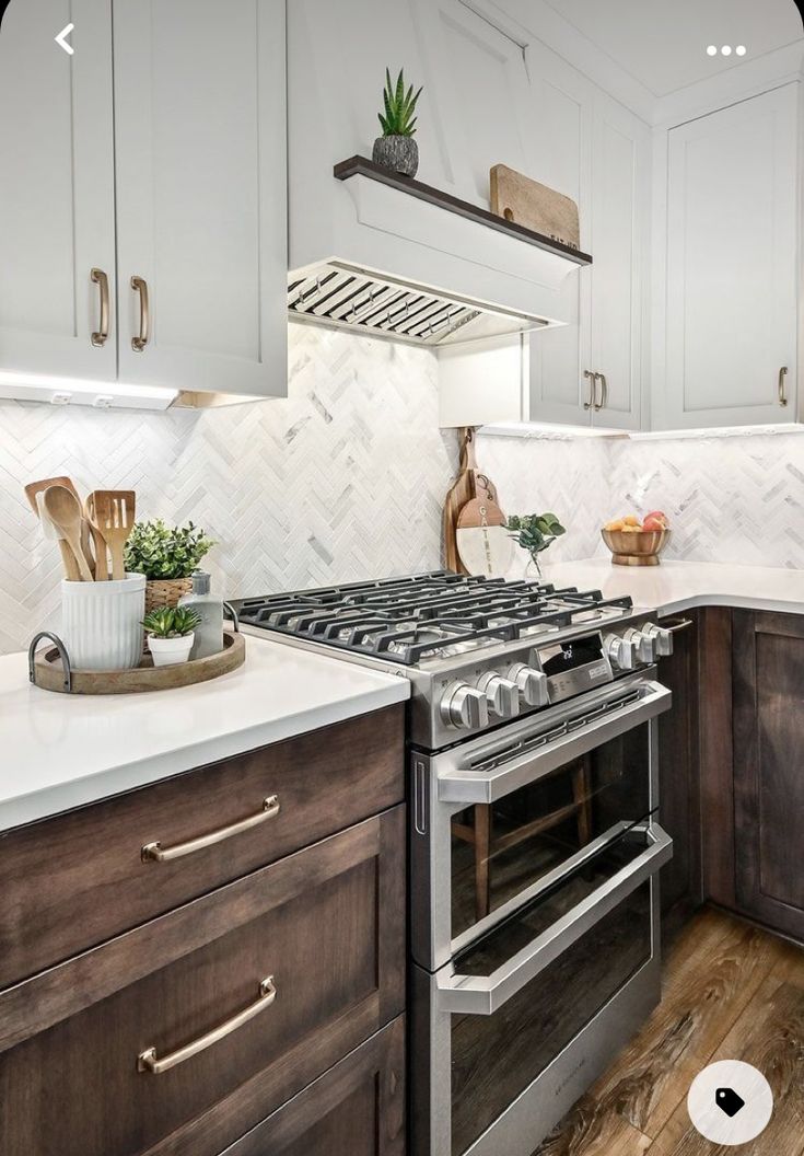
Dark walnut base cabinets paired with white painted MDF uppers create a classic contrast that suits both traditional and modern kitchens. White oak lower cabinets with pale gray painted upper cabinets create a gentle contrast that supports a timeless style.
In a small kitchen, use a dark wood tone sparingly, such as on the island or one cabinet section, to prevent a cramped or heavy feel.
Cabinets Without Handles
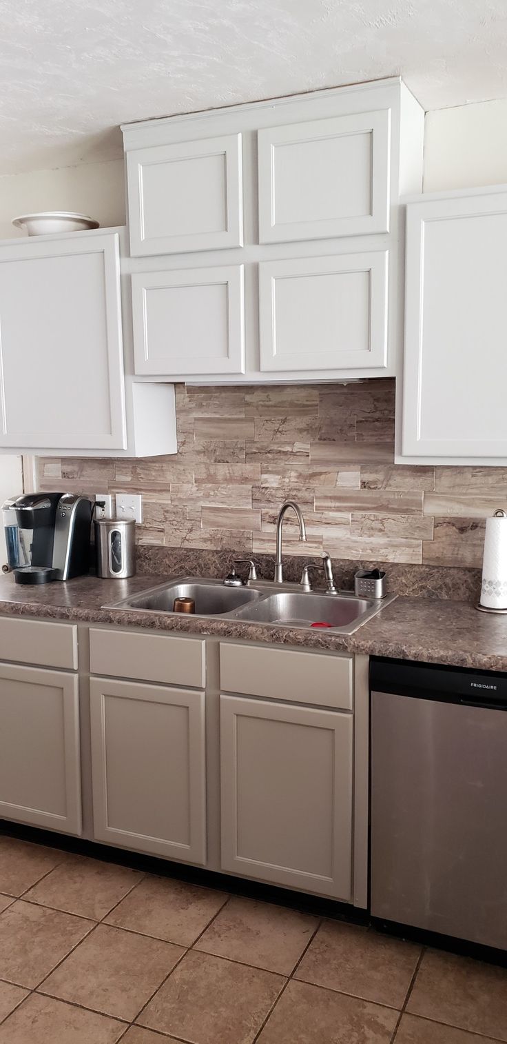
A push-to-open system suits modern two-tone kitchens and keeps cabinet surfaces free of visible hardware. On an uninterrupted cabinet front, it creates a continuous surface that emphasizes the cabinet colors.
Soft-close mechanisms, offered by many manufacturers, prevent slamming and protect cabinet finishes. An integrated finger pull along the top edge of the lower cabinets eliminates separate handles and supports a minimalist style.
Around the sink, a handleless design reduces competition with the faucet and can be a practical choice when remodeling the sink area. It also eases cleaning, while hardware in high-moisture areas can collect grime.
Natural Light
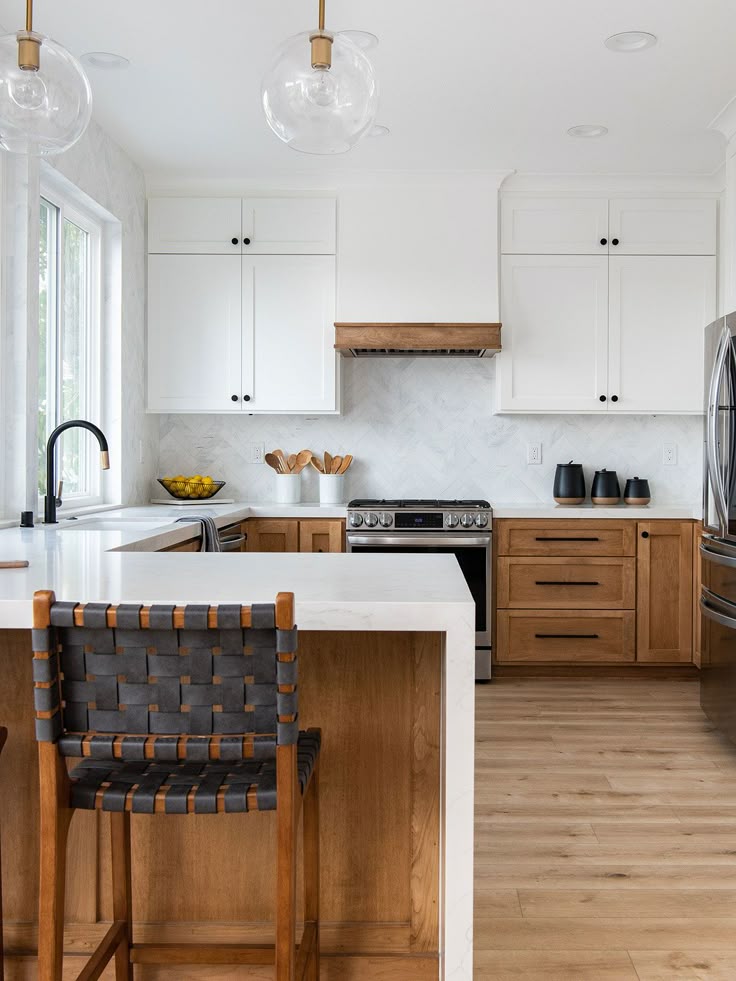
Consider how natural light affects the cabinet color scheme before choosing colors. In a south-facing kitchen, bright, warm natural light can make colors appear more vibrant, so cooler tones may help balance it.
Natural light changes throughout the day in an east-facing or west-facing kitchen. Test the cabinet colors at different times to see how they look as the light shifts.
With limited windows, lighter upper cabinets can reflect the natural light available in the kitchen. In smaller spaces, white or cream upper cabinets paired with darker lower cabinets can create a balanced light-and-dark combination.
Hinge and Pull Choices

Visible hardware should be selected intentionally because its finish and shape become part of the cabinet design. In a two-tone kitchen, choose different hardware finishes only when each one complements a cabinet color. For example, brushed-gold pulls work with navy lower cabinets and white upper cabinets. Hardware combinations can change how the two cabinet colors relate to each other, so consider the finishes together rather than choosing each piece separately.
- Black hardware pairs with white and wood cabinets, giving both cabinet colors a shared finish.
- Brass pulls pair with green and cream cabinets, bringing the two cabinet colors together through the hardware.
- With blue and gray cabinets, stainless-steel hardware provides a finish that works across both colors.
The soft-close feature is hidden inside the hinge, but it supports daily use by keeping the doors from slamming. Consider soft-close hinges for all cabinet configurations. An undermount drawer slide stays out of sight, provides a clean appearance, and maximizes the available storage space.
Match the hardware finish to the faucet and light fixtures so the visible metals coordinate throughout the kitchen.
Practical Accessories
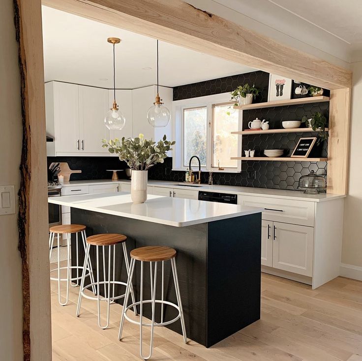
Small appliances can support the two-tone look when their colors relate to the cabinets. Match toasters, mixers, and coffee makers to one cabinet color to make the arrangement look intentional rather than random.
Use open shelving to display items that complement both cabinet tones. Display dish sets in coordinating colors, and use glass storage jars to hold ingredients while adding another detail. Cookbooks with spines that follow the color scheme can fill out the shelf display.
Over the island, select pendant lights that work with both cabinet finishes. Brass pendant lights add warmth alongside blue and white cabinets. The backsplash can also serve as a decorative element; a subtle pattern that uses both cabinet colors creates harmony in the two-tone kitchen.
Two-Tone Cabinet Design

Two-tone cabinetry uses two finishes or colors, with the upper cabinets differing from the lower cabinets. A kitchen island may use a different color from the perimeter cabinets, giving the two areas a clear distinction. Natural wood, navy, or black can finish the lower cabinets, while white upper cabinets complete the pairing.
Complementary colors can create visual distinction between the upper and lower cabinetry, but they should separate the two finishes without making the combination feel disconnected. Consider existing kitchen elements before choosing the cabinet combination, including the flooring materials, wall colors, countertop finishes, and hardware styles. Look at the walls alongside the cabinetry before settling on a combination, and account for hardware that is already part of the kitchen.
Island Coordination
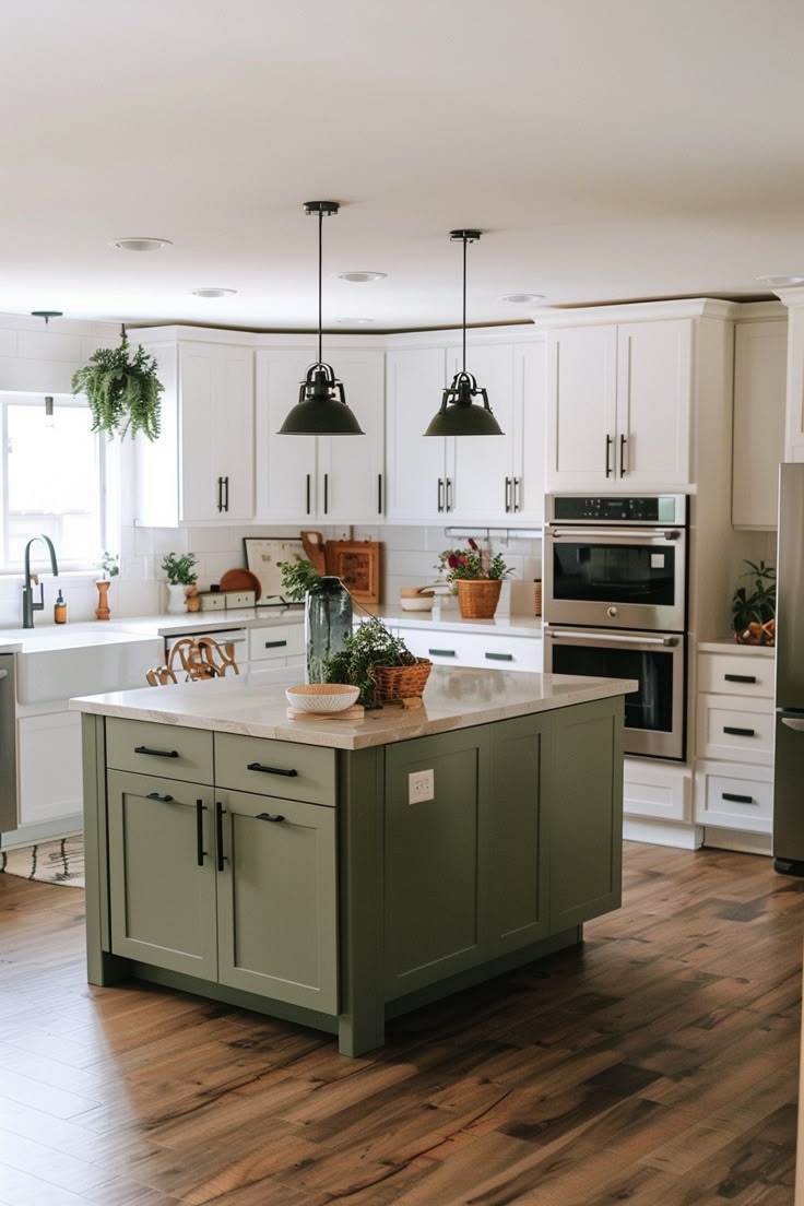
Using a darker tone on the island creates contrast with lighter perimeter cabinets, making the island a visual anchor that distinguishes it from the rest of the kitchen. The island’s color and material can differ from the main cabinets while still coordinating with them.
A white main cabinet color contrasts with an island in navy blue or forest green, while a natural or stained wood island contrasts with painted cabinets and adds warmth. Match the island countertop material with the perimeter countertop material to unify the kitchen.
Contrasting Color Palettes

A bolder statement comes from choosing contrasting colors, which sit opposite each other on the color wheel. White upper cabinets paired with black lower cabinets create a classic black-and-white contrast with drama and definition. Dark lower cabinets in black or navy can ground the kitchen, while white upper cabinets bring brightness and openness to the space.
Other contrasting combinations include white upper cabinets with forest green lower cabinets, cream upper cabinets with deep blue lower cabinets, and light gray upper cabinets with burgundy lower cabinets.
Glass-Front Cabinets

Glass-front cabinets offer another way to vary finishes and display items in a two-tone kitchen. Their doors can use a different frame color from the solid cabinets, giving the frames their own distinct color. Frosted or seeded glass paired with interior cabinet lighting can create depth, while bold interior paint can add visual interest and let you display dishes and collectibles without requiring the exterior cabinetry to carry the entire contrast.
Floating glass shelves can replace some upper cabinets and pair with two-tone lower cabinets, making them an option for modern kitchens.
Mixed Cabinet Materials
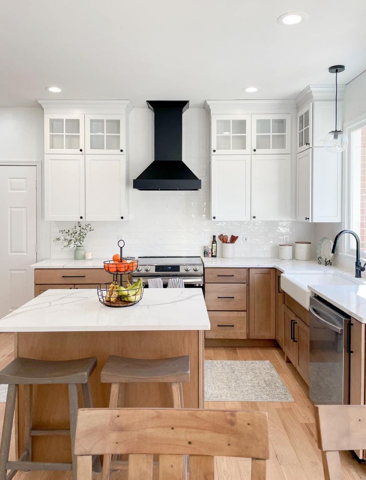
Different cabinet materials can create visual interest in the kitchen. Oak or maple cabinets can contrast with industrial materials such as stainless steel or concrete countertops, giving the space a dynamic quality. A deliberately planned mix can make the kitchen feel intentionally designed.
For budget-friendly cabinets, consider plywood with a quality veneer. Plywood forms the base, while the veneer covers the surface. Compared with solid natural wood, this construction costs less while still providing the look of natural wood.
Coordinated Backsplash Details

Choose the backsplash with both cabinet colors and the rest of the kitchen in mind. It should bring the two tones together across the kitchen so neither feels disconnected.
Simple white subway tile keeps the surface clean, while grout matched to one cabinet color ties the backsplash to the cabinetry. A marble backsplash brings in veining that reflects both cabinet tones, linking the colors through the surface. Patterned tile can contain both cabinet colors along with one accent color, giving the backsplash a shared palette. White square tile with warm terracotta grout connects cool upper cabinets with warm wood lower cabinets, creating a link between the two cabinet areas.
Custom Cabinet Features
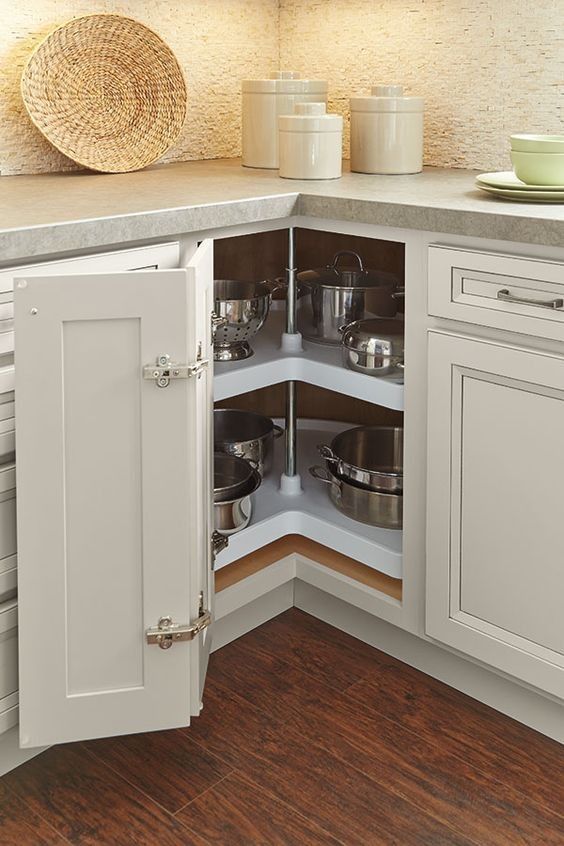
Functional features such as pull-out racks, appliance garages, and custom storage can be incorporated into a two-tone cabinet plan. A pull-out spice rack between the cabinets stores cooking essentials and can add a contrast color, while a custom wine rack with a different finish creates visual interest by contrasting with the surrounding cabinets. A built-in appliance garage in an accent color hides small appliances, and custom drawer dividers made from contrasting woods organize utensils inside the drawers.
Under-cabinet LED strips highlight the two-tone design and make workspaces more functional. A custom corner solution, such as a lazy susan, maximizes awkward spaces while maintaining the color scheme.
Two-Tone Benefits

Two-tone cabinets add color variation without overwhelming the space. Dark lower cabinets can ground the room, while light upper cabinets create an airy, open feel. The design can also create visual zones that highlight architectural features, a baking station, or a coffee bar.
Two-tone designs can be budget-friendly: keep the existing upper cabinets and refinish the lower cabinets to save money and resources. They can also age well; if one color becomes undesirable, update just one cabinet section instead of the complete kitchen.
Glossy Finishes
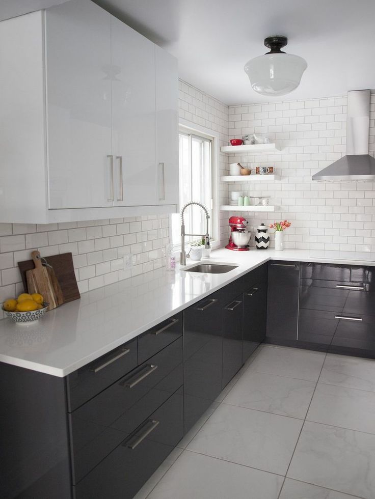
A high-gloss finish adds a reflective element to a two-tone kitchen. Glossy cabinets have light-reflective surfaces that can make the kitchen seem larger and more open. A contemporary kitchen can suit a lacquer finish especially well, particularly on the upper cabinets, where the glossy finish can contrast with lower cabinets in a matte or satin finish.
White or cream glossy cabinets pair with natural wood cabinets, balancing warmth with modern style. The reflectivity of the lacquer also highlights the wood texture.
Consider maintenance when choosing glossy finishes, since glossy surfaces are more prone to fingerprints than matte surfaces. Use them in areas that receive less contact, with upper cabinets preferred over spaces near the sink or refrigerator.
Neutral Cabinetry

Gray and white offer a neutral pairing that can feel both modern and timeless. Neutral colors provide a safe approach while still supporting a stylish kitchen, and white upper cabinets over gray lower cabinets create an airy feel with added dimension.
Wood tones keep the palette neutral when paired with white upper cabinets and wood lower cabinets. White cabinetry keeps the look crisp, while natural wood brings warmth and texture for a warm, organic feel. Pair subtle two-tone colors for a restrained cabinet combination.
Cream and beige keep the two-tone effect soft. Light gray and dark gray add contrast without moving far from a neutral palette, while white and off-white create a very gentle variation in cabinet color.