

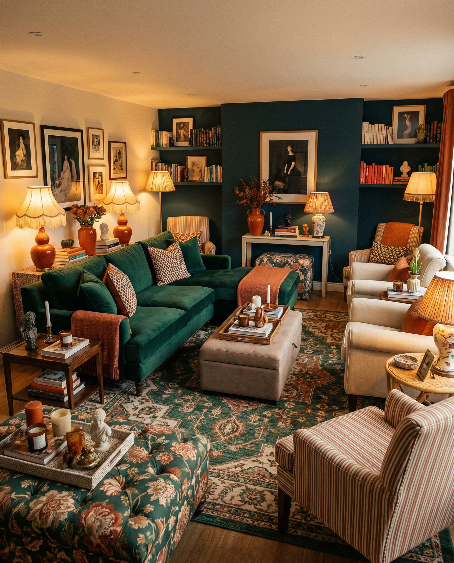
This practical guide to Eclectic Maximalist Decor covers color mixing, palette ideas, a simple pattern cheat sheet, and a no-shopping reset for rooms that start feeling too loud. The goal is a space that feels collected, lively, and intentionally eclectic.
At 7:18 p.m., with a lukewarm coffee being repeatedly forgotten and a dog aggressively burrowing into a throw pillow as if he pays rent, the living room raised an important question: how can a love of color exist without creating accidental chaos?
If you are working toward eclectic maximalist decor, that tension probably feels familiar. The goal is a room that feels alive, gathered over time, and delightfully unhinged, not a space that looks like every clearance aisle pillow came home at once.
Mix color in real homes by working within a budget and checking how each choice affects the room. Use a few practical examples and simple rules when deciding whether another unusual pattern belongs.
Quick Room Styling Start
With guests arriving soon, give yourself 10 to 20 minutes for a quick room reset. Focus on changes that make the room feel more put together without starting a full redesign.
- Choose one dominant color to guide the rest of the room’s choices. Let it lead the larger visual elements so the room has a clear starting point.
- Look for a book spine, candle, art detail, or vase that already carries a useful color. Find at least 2 repeats of that color and use them to connect the room’s smaller features.
- Remove 1 unhelpful color from the room, especially if it competes with the main palette. Taking out one distracting color can make the remaining choices easier to read.
- Use a tray, bowl, or book stack to corral small items. Keeping them together can make the room feel calmer.
- Use the lamps to check how the colors appear in the room. See whether they look icy or muddy under that light before making a final choice.
A room redesign does not need to take all day. Set aside 1 hour and use it to make a focused set of changes rather than trying to solve everything at once.
- Choose 1 dominant color, 1 supporting color, and 1 neutral for the room. Record the color scheme so you can refer back to it as you make other choices.
- Map the color scale before assigning colors to objects. Use large colors on large objects and small colors on small objects.
- Begin with one main scene, then carry the same accents into two smaller echo zones. Arranging accents across those three areas helps the choices relate without making them identical.
- Vary the pattern scale among large, medium, and small designs. Include a solid element for visual relief so every surface is not competing for attention.
- If a color appears only once, either repeat it or remove it. Aim to repeat a useful single-use color 2 times so it feels connected to the rest of the room.
Bold Palette Control
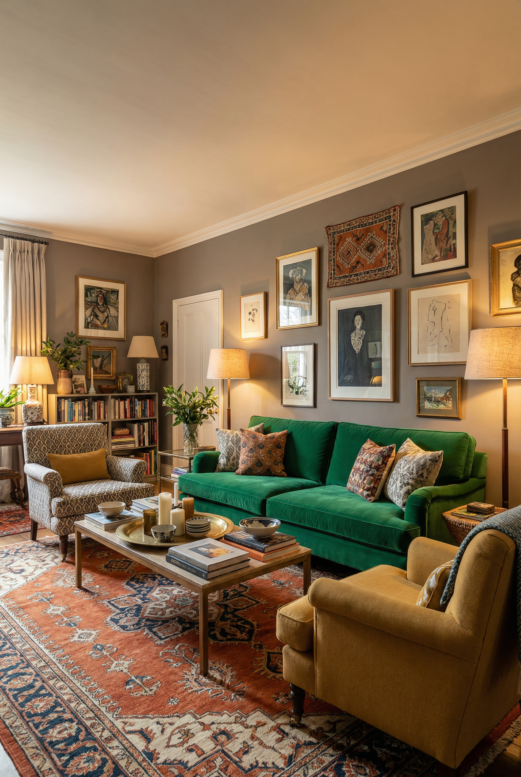
Start with a simple palette rather than adding colors one by one, since excess colors can make it unclear. On the main surfaces, choose 1 dominant color, 1 supporting color, and 1 neutral to establish defined color roles.
Use 1 color as the dominant color, carrying the strongest presence in the palette. Add 1 supporting color alongside it while keeping its role distinct from the main color, and use 1 neutral to balance the palette and give the stronger colors a quieter setting.
Palette Recipes

Clear color roles can make rooms feel less stressful. Giving each color a defined place keeps the palette easier to follow.
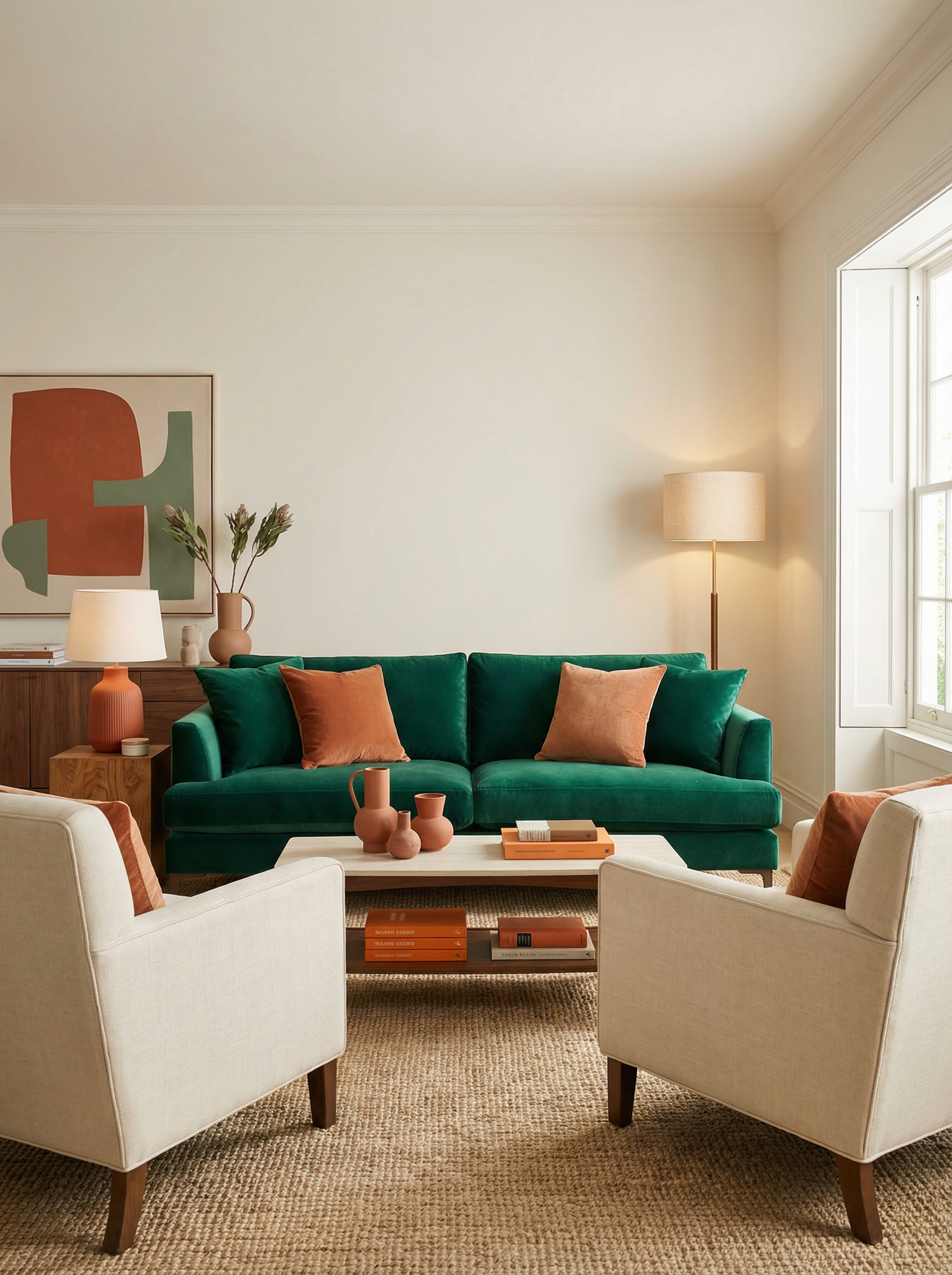
Palette 1 pairs emerald and rust with warm cream and brass for a rich, balanced mix.
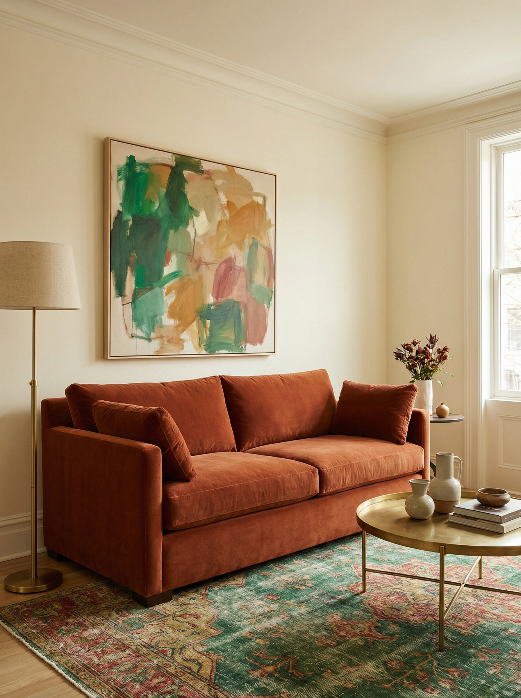
Use warm cream or a creamy off-white on the walls; either option keeps the wall color within the same light range. Leather is optional for the sofa, but it can introduce rust, camel, or warm brown through the upholstery. Choose a vintage rug with emerald woven through it to connect the green with the rest of the palette. Add one large piece of art featuring green with smaller amounts of warm red or ochre; its scale gives those colors a clear visual presence without making them equal in weight. Green walls paired with a green sofa may create a swamp effect under warm lighting, so check the combination in the light the room will actually use.
Palette 2 brings cobalt and caramel together with soft gray-green and black for a varied color combination.

Use soft gray-green on the walls, or choose a neutral instead; green trim can provide an alternative wall treatment. A cobalt sofa can replace a cobalt rug while keeping cobalt prominent in the palette, shifted to the seating. A caramel, tan, or other warm-neutral rug can soften the blue; place these warmer colors alongside the cobalt so the room does not feel as cool. Frame blue art in black to keep the color within the palette, with blue in the artwork and black on the frame. Because too many cool colors may make the room feel chilly at night, consider adding warmer notes if the evening view feels too cold.
Palette 3 combines plum and blush with walnut and cream, creating a warm mix of color and wood.

Use cream on the walls, or choose plum if the room has suitable light. For seating, consider walnut leather, warm neutral linen, or deep brown velvet; each material keeps the furniture within the warmer palette. A gritty rug in blush and cream can bring those colors down to the floor, while its texture adds another surface treatment. Place a large piece of art with smaller plum and blush prints around it to support the main piece. Choose dusty blush rather than candy blush to keep the pink more muted.
Palette 4 uses teal, mustard, ivory, and red in one lively color combination.
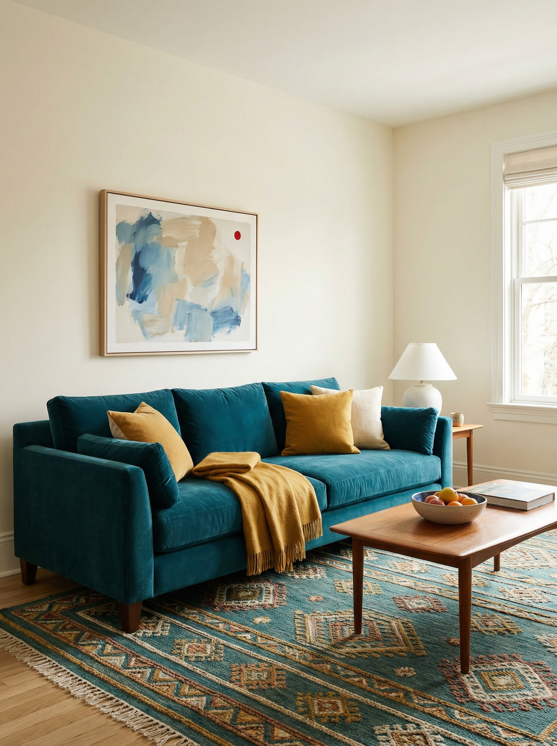
Use ivory on the walls to give the stronger colors a lighter background. Choose a teal sofa as the main seating color, or use a teal chair if you are easing in; either option carries the color without requiring both pieces. A patterned rug can combine teal with warm tones, connecting the floor to both the cool and warm parts of the palette.
Place one piece of art with a small amount of red to connect it to the palette without letting it take over. Mustard can feel heavy on large surfaces in a warm room, so use it with care when it covers more than a small accent.
Palette 5 centers on terracotta, olive, and cream, with mixed metals adding another finish to the scheme.

Use cream on the walls to give the palette a light base, and keep the wall color cream. Choose a sofa in a warm neutral or olive: olive adds drama without requiring neon energy, while a warm neutral keeps the seating quieter. Use either a terracotta-heavy vintage rug or a natural-fiber rug layered with terracotta, letting terracotta carry the rug’s strongest color. Choose art with earthy colors and a crisp modern shape to bring a clear edge to the earthy palette. Because olive, brown, and beige may become muddy without crisp contrast, add a clearer contrast so the combination does not blend together.
The dominant color is the bold room color with the strongest visual presence. In 11 examples, jewel tones create a deep, cozy effect rather than a neon one.
- Warm cream walls can sit behind a rusty terracotta rug. Add emerald velvet curtains to bring the deeper green into the room.
- A cobalt sofa can work with caramel leather and soft gray-green trim. The three colors assign the stronger blue, warmer material, and quieter edge their own roles.
Choose a slightly muted colorful wall shade instead of a pure candy color. A muted wall color may photograph better and may feel kinder at night, especially when glossy ceramics contrast with matte paint. Start with one large object, such as a sofa, headboard, or dining chairs, and anchor the room with its color. Echo that anchor color 2 to 3 times in a vase, rug stripe, or art edge.
Maximalist style benefits from color repetition, especially when the repeated color appears in different textures. Keep the color connected while changing how it is used. View the room at night with lamps only, because its evening appearance matters and interior design can relate to emotional regulation.
When colors look muddy, add a clear warm note such as brass or ochre. Either example can give the palette a warmer point of definition.
Pattern Mixing
Include 1 quiet pattern among louder choices, and vary pattern scale because an all-loud mix can impair visual focus. Begin with 1 large hero pattern, such as a large floral, bold stripe, or vintage rug, as the main pattern in the mix. Add smaller secondary patterns that share the hero color; their smaller scale keeps them from competing with the main pattern and helps the mix stay connected.
Pattern Formula
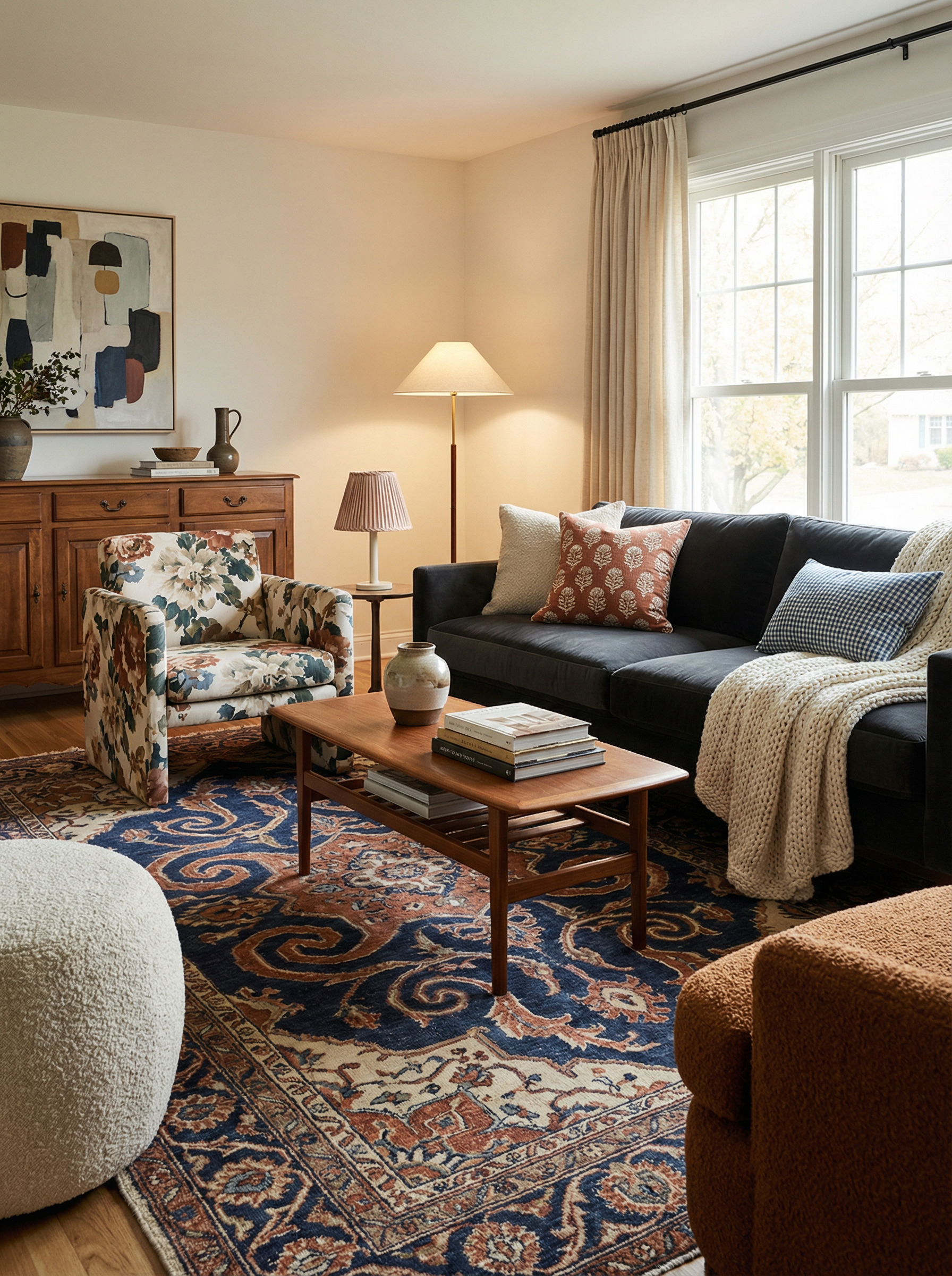
A pattern formula uses four layers, each with a distinct role in the mix.
- Start with 1 large primary pattern, using a rug, curtains, or a large chair. This is the main patterned element.
- Add 1 medium secondary pattern on a throw, pillow, or upholstered ottoman. Its scale should sit between the main pattern and the smaller details.
- Use 1 small detail pattern on a small pillow, lampshade, or small print. It completes the scale progression without becoming the main focus.
- Include 1 solid element for visual relief, such as a sofa, blanket, large pillow, or plain curtains. The solid surface gives the patterns somewhere to rest.
A quiet pattern has low visual intensity and supports larger pattern choices without demanding the same attention. It can look nearly solid, so look for small, tone-on-tone designs with low contrast, such as tiny stripes, subtle checks, soft speckles, or faded botanicals. For example, a large indigo and tan ikat rug can lead the mix, paired with a small indigo gingham pillow and a nearly solid throw with a micro print.
Vibrant prints can work when the pattern hierarchy is clear. Mixing patterns from different eras, such as a traditional rug with modern art, creates contrast, while a solid sofa or plain linen curtains can help mismatched furniture feel connected. Add depth with bouclé, mohair, chunky knit, and washed linen. Wood and metal provide material contrast around the arrangement, while a slick printed pillow and a nubby throw add more texture. The layering may look subtle in person but appear large in photos.
When children are present, choose a stain-hiding pattern. Food stains may show quickly on a pale cream pillow.
Repetition for Harmony

Repeat design ideas without using identical objects. Repeated colors, shapes, or materials can connect a room while keeping each piece distinct, helping a collected room feel intentional rather than random. Eclectic maximalism can combine vintage decor, modern art, and thrifted items, but several repeated threads should give those different pieces visible connections.
Repeat warm wood, black accents, and soft curves across the room, or use brass, dark green, and a specific pink as recurring design threads. Carry each color, material, or shape into more than one area without making the objects identical. Use varied frames on a gallery wall while creamy white mats keep the display consistent through repeated matting, and repeat a material such as rattan or marble in separate zones so the room relates across its areas.
Support a statement piece by echoing its shape or color elsewhere. A sculptural lamp or vintage chair can guide those repeated details; repeat a curved form through a curvy lamp, arched mirror, or rounded pottery, or echo a graphic form with a graphic painting or striped pillow. These small design decisions build cohesion by repeating color, shape, or material.
Cohesive Accent Placement

Place accents around existing focal points rather than scattering them evenly. Evenly distributed accents can make a room feel visually busy and may reduce its distinctiveness. Divide the room into zones, such as the sofa wall, the bed, and the dining area; maximalist interiors often use zone planning to give each part of the room its own focus.
At the sofa wall, bed, or dining area, use color and art boldly within the main scene zone. Keeping those choices in one zone gives them a clear place to work. Use two echo zones, such as a reading chair corner and a console table, to repeat the main scene’s colors more quietly. The dining area is another possible main-scene zone alongside a sofa wall or bed, and keeping the chosen zones connected helps the arrangement feel cohesive. A console table can echo the look, as can the corner with the reading chair; together, these smaller areas extend the arrangement.
A pleated shade or a sculptural sconce can make the lighting itself distinctive. Colored glass lamps can carry color without adding another textile pattern, making the light fixture part of the room’s color plan. A warm tan throw or brass lamp can serve as a bridge color: a navy sofa with a red patterned rug may feel too intense, so add a bridge color to connect them.
Use accent containers such as a tray, book stack, single shelf, or console vignette to keep color contained. This can make the color feel less chaotic, and you can change the effect without repainting. Current decor trends feature bolder art with softer surroundings, letting the art stand out without making every part of the room equally strong.
Room Mess Fix-It Flow

Step 1 is a 3-minute room reset. Start with the main surfaces, including the coffee table, console, and dining table, and remove the small loose items. Temporarily place them in a basket or laundry bin as staging while you reset the room.
In step 2, look at the surfaces and identify the type of mess rather than treating every mess the same way. Ask whether it is mostly stuff or mostly visuals. If it is mostly stuff, go to step 5; if it is mostly visuals, complete steps 3 and 4 first so you address the room’s visual issues before continuing.
Step 3 is to remove a random color from the room. Identify any color that appears only once, since a single-occurrence color may feel out of place. Temporarily move that color to a closet or another room, or swap it for something else. If you miss it later, return it with a buddy color to support its place in the room.
Step 4 is to add a solid item for visual relief, giving the surrounding colors and patterns a calmer place to rest. A plain throw on the sofa, a solid pillow, or a simple blanket folded on a chair can serve this purpose and reduce visual busyness.
In step 5, create 2 zones so the layout has a clear division. One zone can be a display area for visible enjoyment, while the other can be a visible contain zone using a tray, bowl, box, or basket. A visible contain zone does not require hiding everything.
Step 6 is to check color repetition in the room. When a color appears only once, repeat it twice through existing items such as books, art, or textiles. Another option is to remove the color.
Step 7 is to check the balance of the patterns. When 3 loud patterns compete, quiet one by switching in an existing solid pillow or throw as the replacement.